
Pao De Alfama
Brand identity
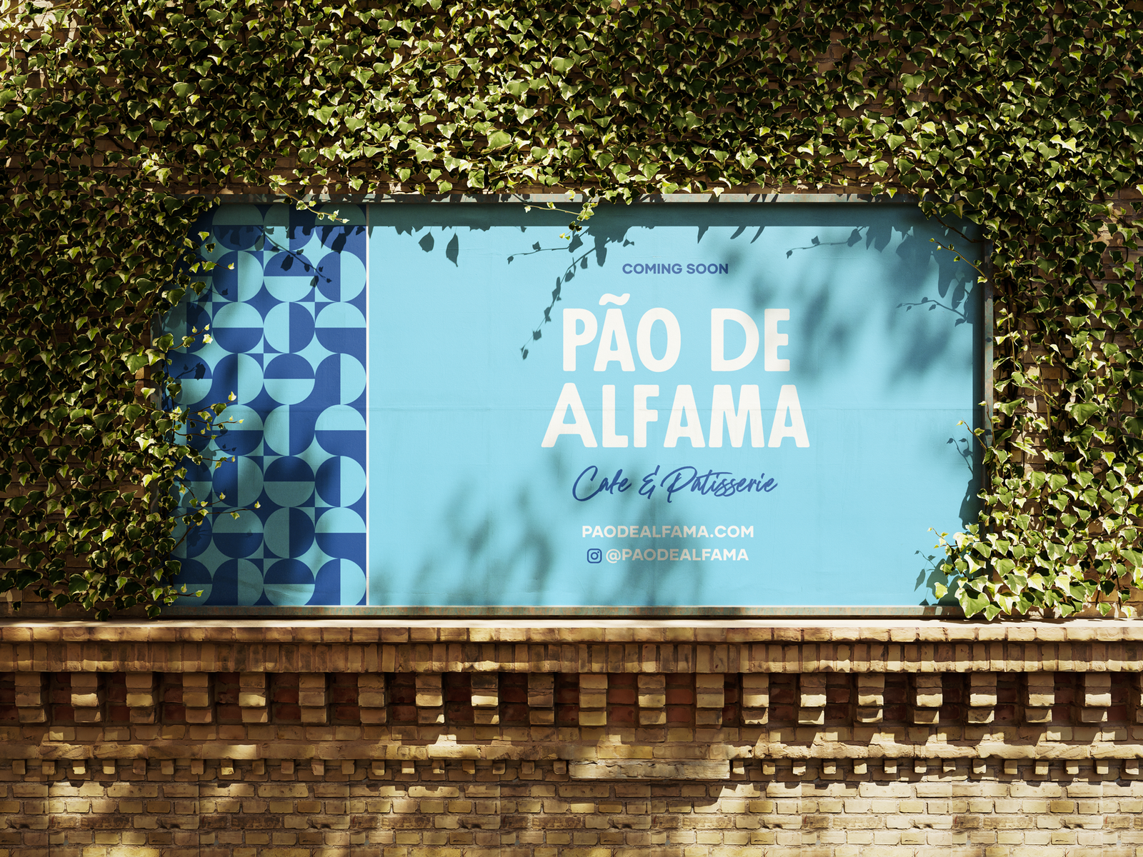
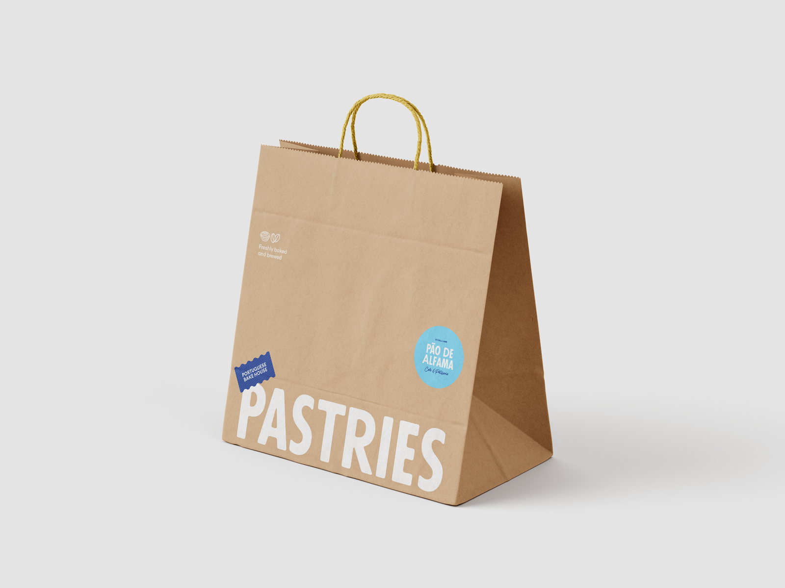
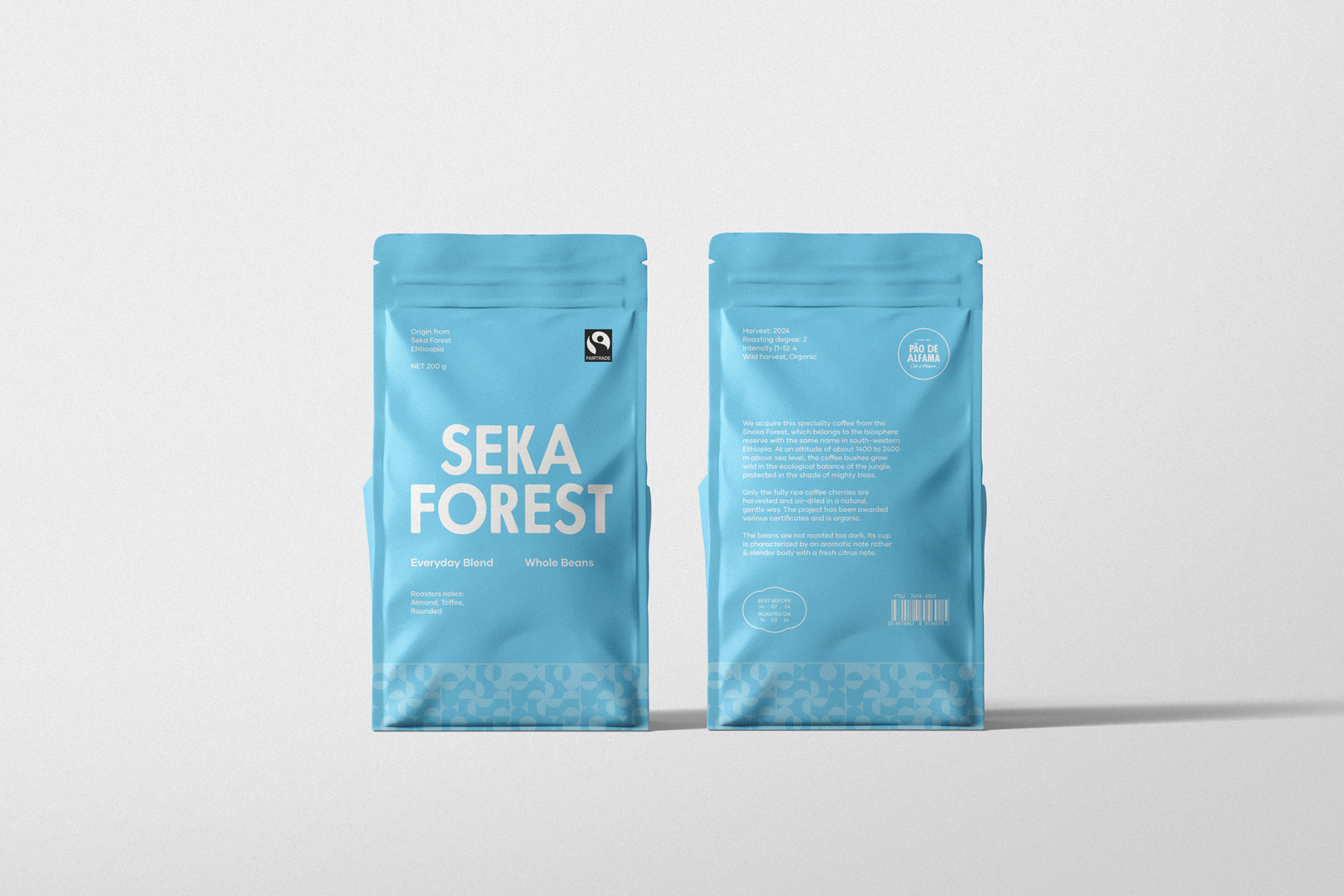
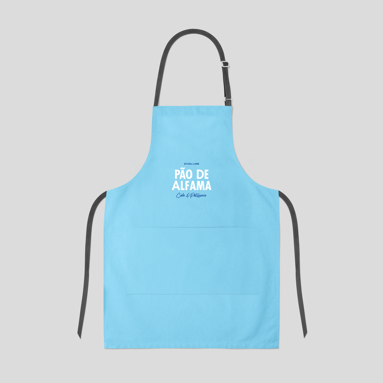
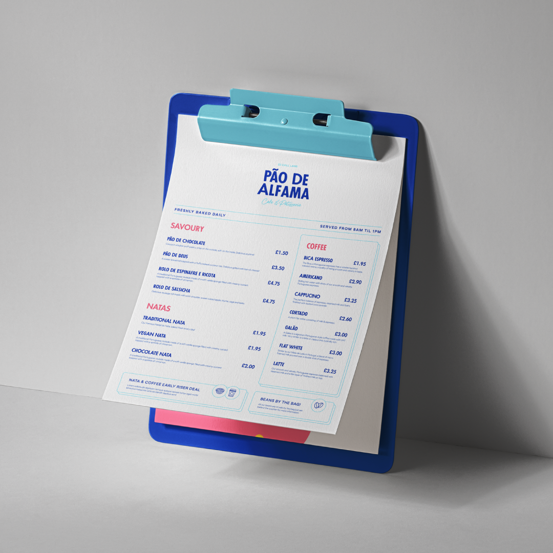
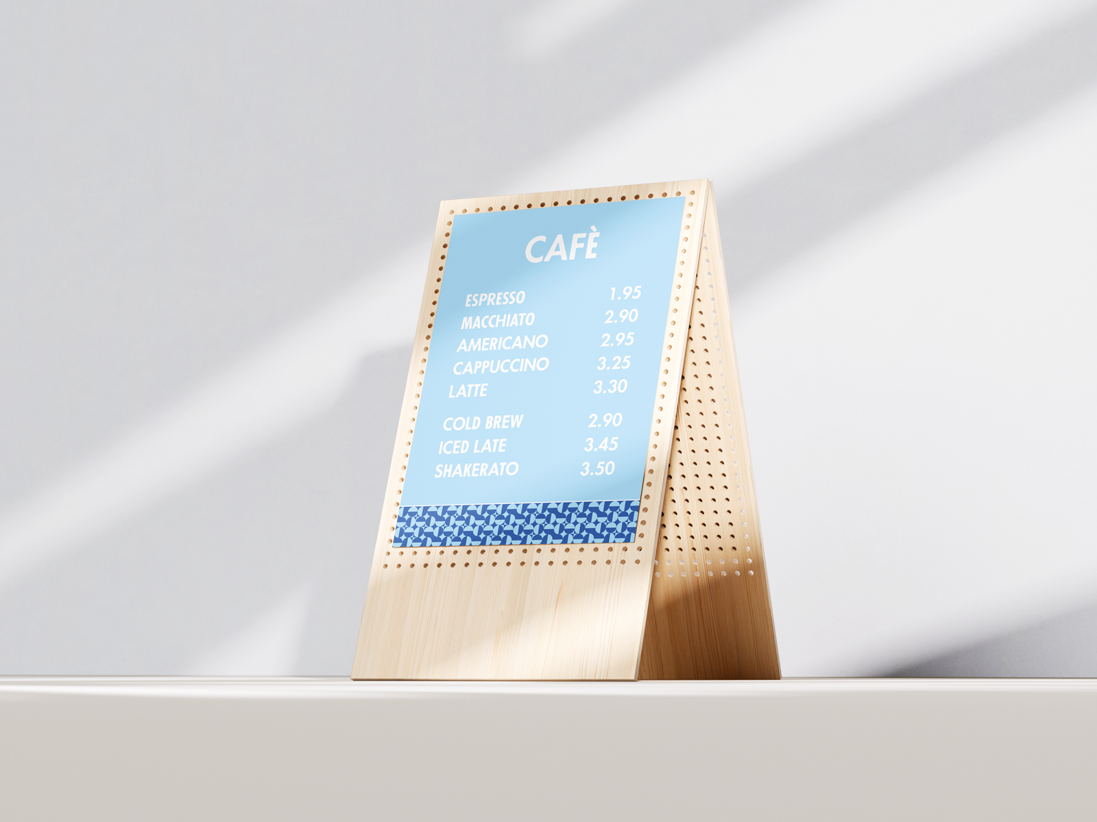
Pao De Alfama is a patisserie celebrating the rich tradition of Portuguese pastries. The brand identity is built around two core elements: typography and pattern.
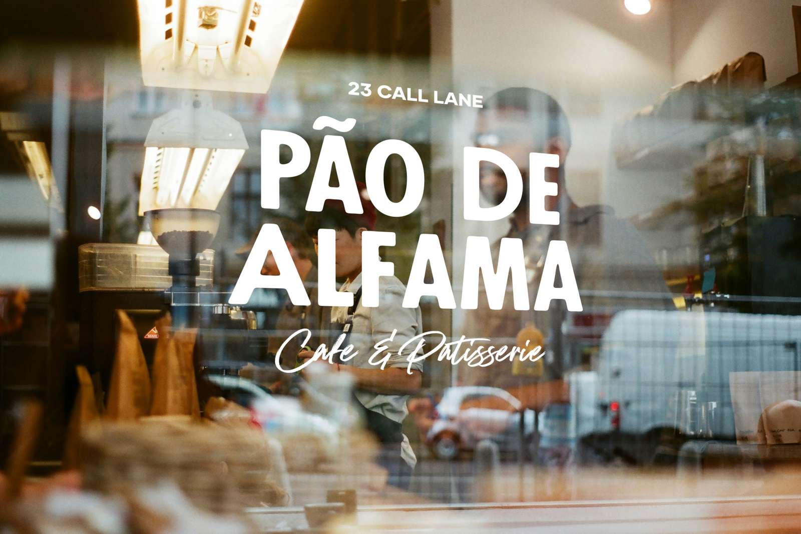
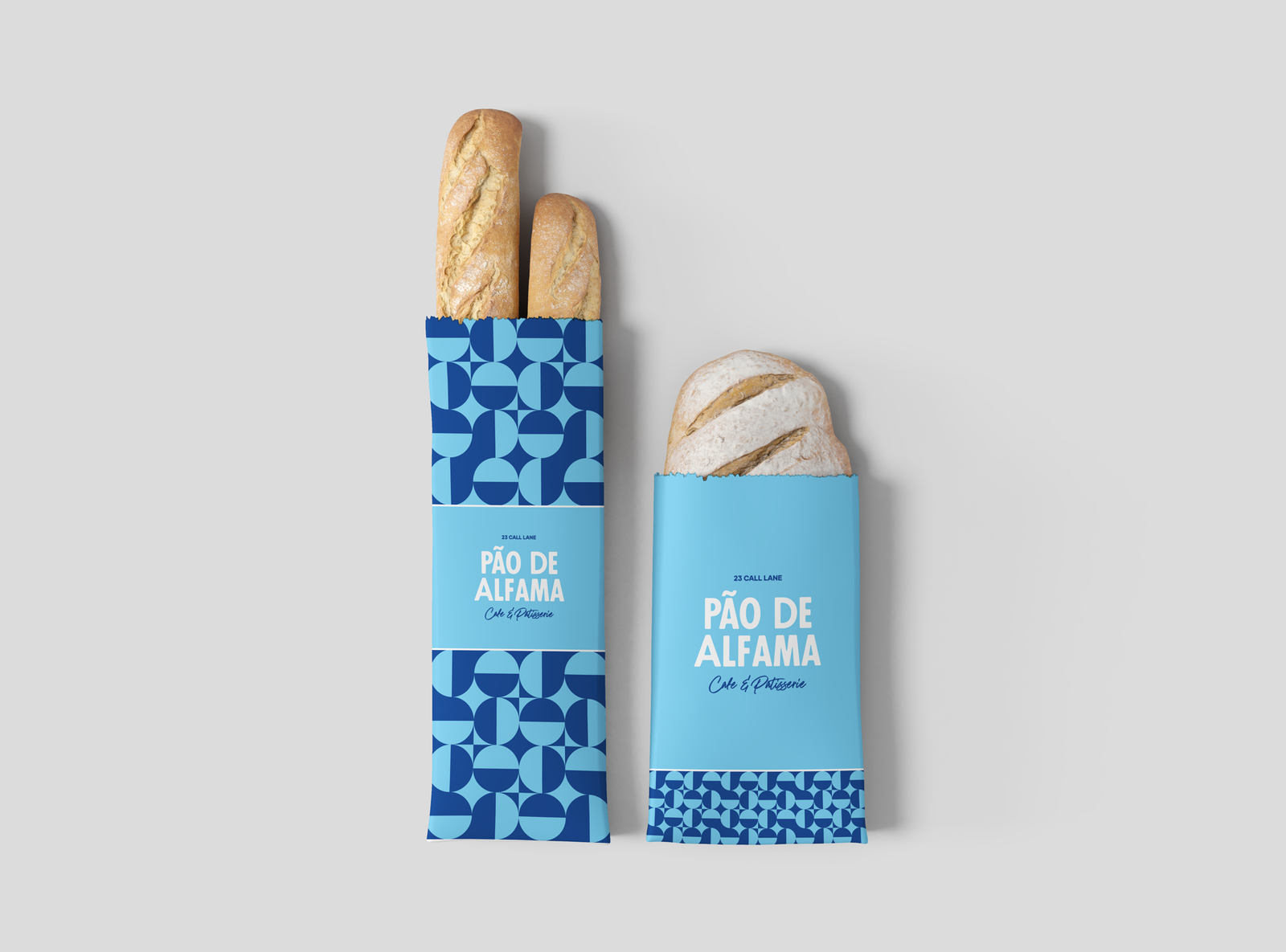
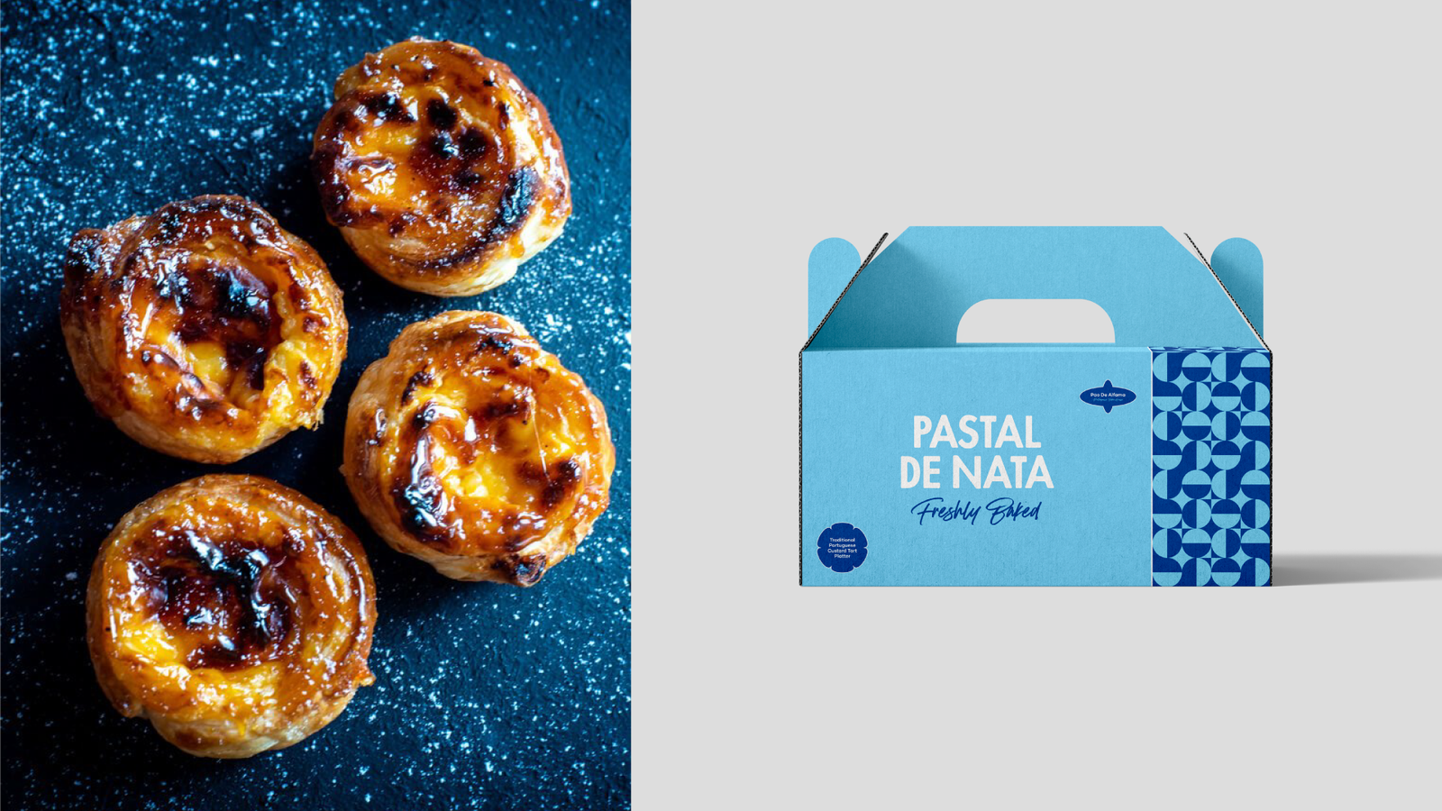
The patterns draw inspiration from Lisbon’s iconic Azulejo tiles, incorporating the distinctive blue tones that adorn the city’s streets and buildings. Complementing this, the wordmark and typography were crafted to feel friendly, approachable, and informal, creating a warm and welcoming personality. Together, the typography and patterns form a distinctive and memorable identity that captures the heritage of Portuguese culture while feeling fresh and contemporary.
Selected Works

Franks ArchitectsBrand identity

BarncaleBrand identity

First RateBrand identity

FAWSBrand identity
BREMMERBrand identity